Illustration
|
Political "POW"er
|
Planning/Concepts
Inspiration
|
My inspiration for this piece was at first just some works of political cartoonists such as James Gill-ray and Steve Bell, who made political cartoons, James coming from more of an English background with more colonial style works, while Steve Bell worked with more 18th century America works and concepts. one of James works that really caught my attention and inspired me was his "A Sphere Protecting Against a Plane", which I don't really understand the message with it, but I am extremely fond with the style of it, and the comical aspect of a rather serious topic in Britain at the time of creation. Now with Steve Bell he was much more of a known American cartoonist, with less of a contemporary and well more obscene style. one of the works I really took inspiration from when I was researching, doesn't per say have a name, but is a part of a collection called "If...." which shows cartoons based on political leaders, and showed different what if situations with them in a comical and demeaning liberal stand point style. Along with the Political cartoon style, I figured I needed to make it pop, as most political cartoons were just prints, of black and white with small variants in color, so I decided to merge it with Pop Art. this proved to be successful as the two work extremely well together as a cohesive style, both being cartoon oriented and bending the laws of anatomy and traditional coloring. The artist I took inspiration from for the Pop Art style was Roy Lichtenstein who is known for many amazing Pop Art pieces, my inspiration being "Crying Girl", and others like "In The Car" and "M-Maybe". These all have a very broad and a kind of "look at me" style that immediately draws your attention to it and around it, making it hard to ignore it mostly because it just Pops out at you, hence why its Pop art. I want to mix both of the styles together, having the pop like style to jump out and cause a conflict like scenario to really explain the opposites of the democratic party and the republican party, to show their own weaknesses, and I found that these two style together really show that well.
|
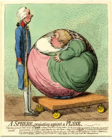
"A Sphere Projecting Against a Plane"- James Gillray
"The Republican Super Tuesday"- Steve Bell
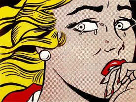
"Crying Girl"- Roy Lichtenstein

"M-Maybe"- Roy Lichtenstein
|
Planning Sketches
|
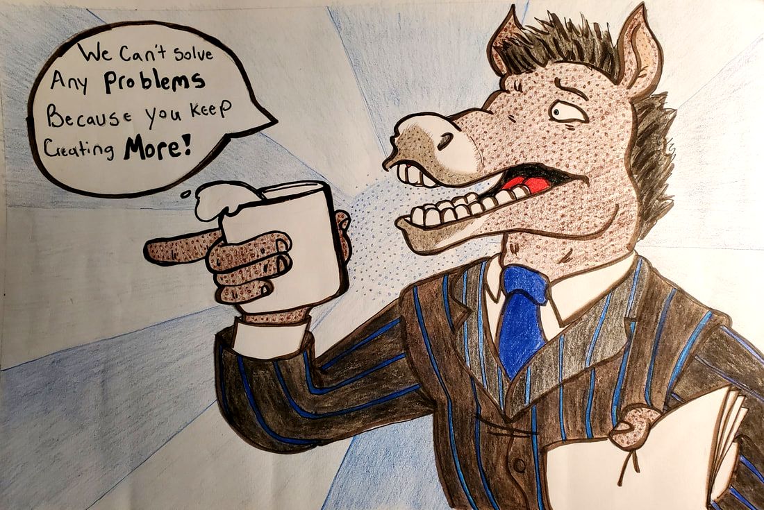
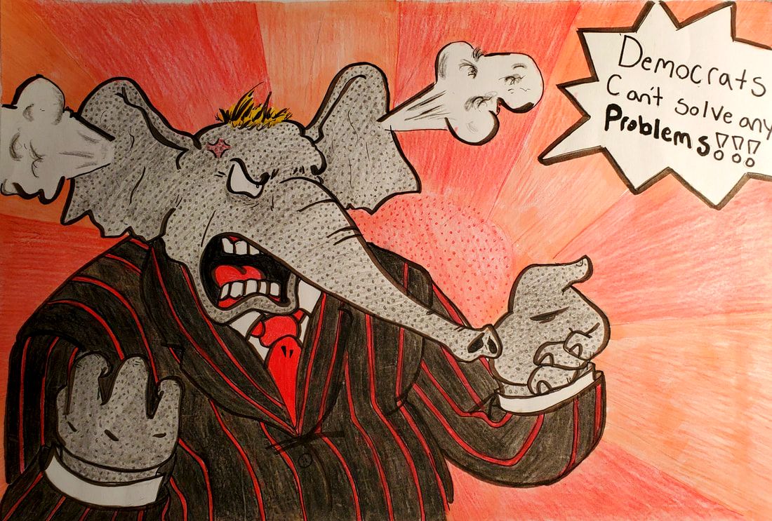
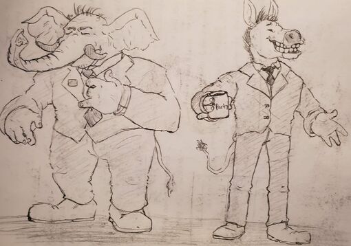
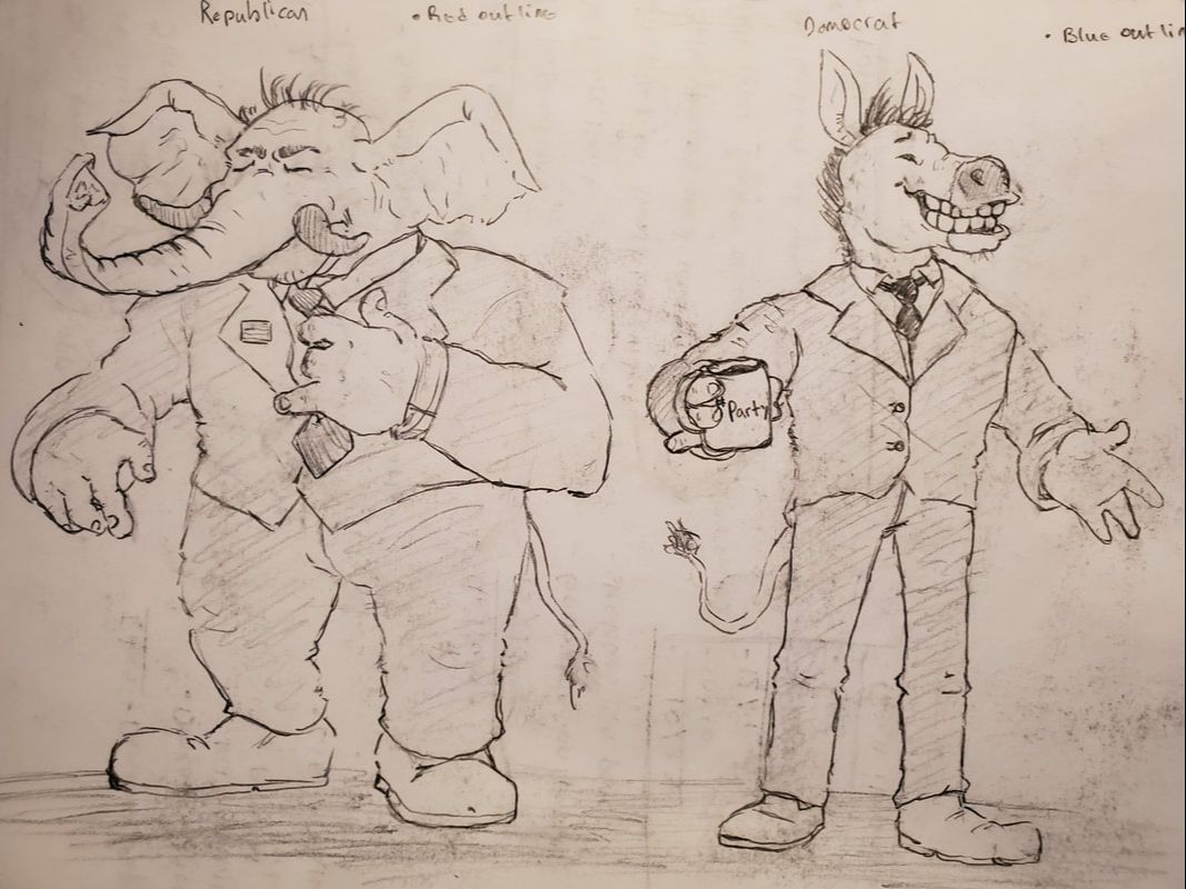
The first planning faze that I went into was planning the actual character designs, and how I wanted to make the characters in the actual pictures to look. I wanted to convey the essence of the political parties in question, by making the democrat young, and happy, and the republican old and grumpy. I did this as most liberals are young millennial, with more upbeat attitudes (from what I've seen) while more republicans are elderly and are more easily angered. I also wanted to make both designs like their flagship logos, being the elephant and the donkey, so anyone anywhere could immediately understand and recognize the characters and the people I am talking about.
|

|
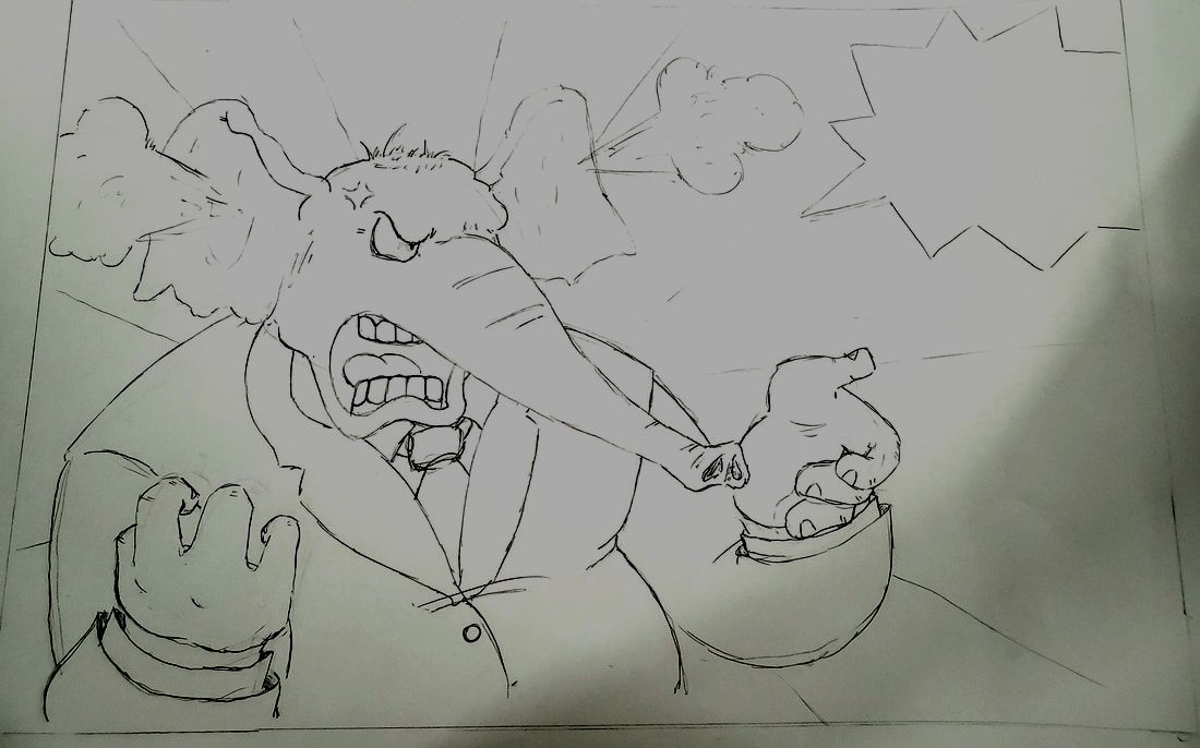
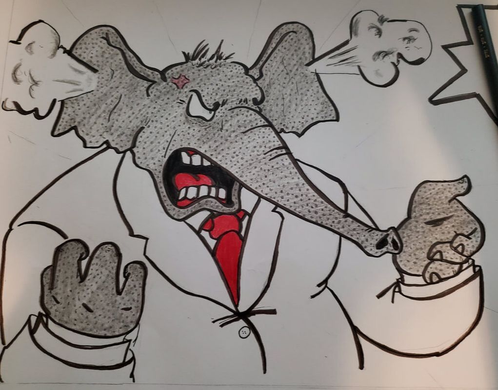
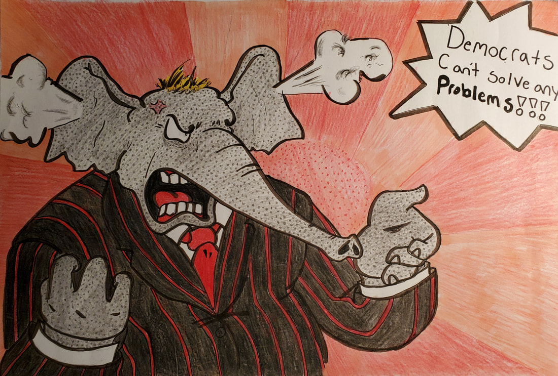
This sketch was my third attempt (the other attempts were too bad to actually put onto here (too sloppy)) so the whole Idea for this concept was to make it so I could convey the opposites of the two political parties, and to show how opposite they really are and can be. and to fit the double illustration requirement, I thought it would be a good idea to make it almost like a comic book argument taking place between two different panels. The character in this picture has smoke coming out of the ears and is visibly upset and angry, not to mention screaming at the opposition, to convey the traits I had explained earlier.
|

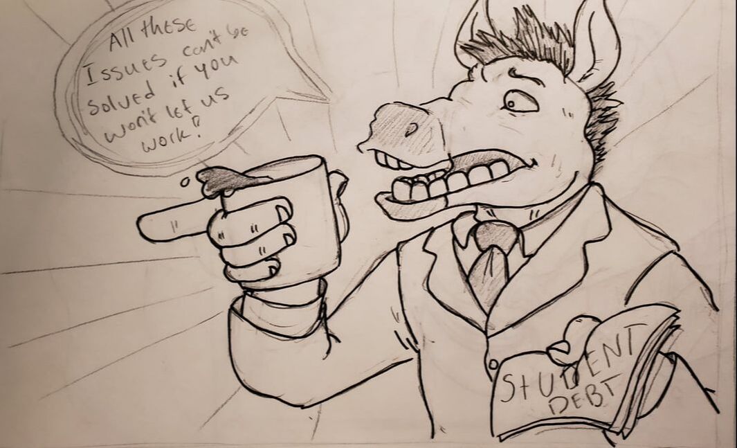
|
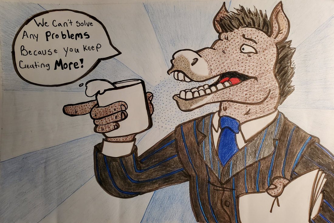
This sketch was the final one, as It is the prt. 2 of the other illustration, this is the other half of the argument that I created, showing the differences in demeanor and in tone between the two parties. I wanted to make the donkey seem more calmed down and almost more frightened by the screaming elephant baby boomer which is what I had based his design on.
|
Process
Experimentation
|
This project didn't have much experimentation as I knew mostly what to do and how to do it, I was no stranger to sketching with colored pencils and coloring with colored pencils to create a cohesive and smooth textured piece that can give me a clean looking piece of art. I was thankfully in my comfort zone with this piece, which allowed me to create what I think to be a very well made dual part illustration, most of the experimentation lied within the creation of the posing for the characters, which came from the sketches. But another major portion was how I conveyed their differences and similarities. My goal was to show how the two political parties of this country are divided, yet they were founded and operated on similar terms and goals. I constantly questioned myself with how I should infuse the two colors of the parties into each illustration, like my first few ideas were to have the colors of the ties be red on the democrat and blue on the republican to show contrast and to show how similar they actually are. Another was to flip the suit colors, but then I decided that wouldn't be a good choice as deep red suits and light blue suits are associated with clowns and aren't found in the political scope really. So I ended up going with a red and blue pin stripe suit for both of the characters in the illustrations. I ended up really enjoying the final product after taking into consideration all of the hidden references and messages I wanted to convey through small parts of the illustrations.
|
|
Process
First I started with creating the characters, I wanted to represent the American political parties in as many stereotypes as I could fit, that actually made sense. I started by basing the two characters off of humanoid bipedal versions of the parties mascots, the elephant and the donkey. From there, I designed their stature, their temperment, their outlook and how they held themself. The republican was definitely an easy one, I made him a bigger, more overweight, old wrinkly man with a grumpy and contemplative look, adjusting his tie and having that stereotypical easily angered demeanor. The democrat was slightly more difficult to design, but was still easily done, as I based him off of Andrew Yang (one of the current 2020 candidates) I represented him as a young forward thinking open minded and more laid back young adult, which I think I got that just right
After designing them I started to draw the basic structure of the two characters onto their respective pieces of art giving them dynamic poses for how I wanted to convey their demeanor and how they hold themselves in a political manor. This was quite easy as I wanted to stick with the always angry republican by having him yell and clutch his fists, with a blood vessel showing on his forehead. Which was countered by the donkey having a more passive and contemplative look, and having worried eyebrows, because he was being yelled at and was also concerned about what is going on politically.
After finalizing the drawing portion of the final sketch, I went over it in a thick and wavy brown ink pen to give it the depth of a pop art character, after inking the lines and giving it the comic book aesthetic, I proceeded to start the coloring process which was quite simple. Because of the art style I didn't have to do much when it came to shading or using gradients. Now to smooth out the rough and jagged parts of the coloring process I went over the whole thing with a very light colored copic marker, which gave it this smooth and shiney texture that I really enjoy, as it gave a nice overall smooth feeling so it didn't look like a coloring book.
|


|
|
Compare Contrast
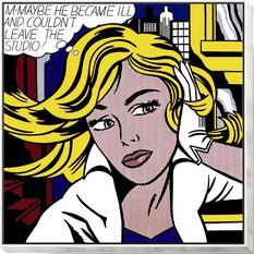
"M-Maybe"- Roy Lichtenstein
|
Similarities:
1. Both use thick black lines to provide borders on certain parts of clothing and outlines the figure 2. have a speech bubble on the top to show what they are saying/thinking 3. sharp popping colors that have no color gradation within them except for black shadows 4. have small dots to provide texture and color, instead of flat color Differences: 1. Human figure within Roy's art piece while mine are anthropoid animals 2. Roy's has an actual city scape as a background while mine is only a 2 rotating colors with a center. |
|
Reflection
The end products of these pieces in my opinion are outstanding, I wanted to convey my political message and beliefs within this piece, but keep them subtle and inconspicuous, which I believe I got down very well. I am overly proud of my craftsmanship, my work ethic, and my skills within creating these two illustrations. From the posing, to the color and wardrobe selection, I think I really made something that I can be proud of with this project. I am so happy with the designs of the characters and how they look and how they convey meaning and message with only two pictures. As for my political message, and what this piece fits in with my overall theme of self expression and self determination, I was expressing my political views through art because no one has listened otherwise, and I feel that both sides can relate to this piece, which is what I am so proud about achieving. I think on a technical aspect through the way I actually designed and processed this piece could have been a little better, as not relying on copic markers to smooth out my piece would have been more helpful, as this piece I believe was supposed to be only colored pencils, but I think this can slip. as the final product looks so much better with it. After this I am super excited to start creating the gouache painting of this piece, to see how I can translate these characters and skills into paintings on illustration board.
ACT Responses
Clearly explain how you are able to identify the cause-effect relationships between your inspiration and its effect upon your artwork:
The artwork I did is entirely influenced by the inspiration I had from my pieces, the second I heard "Opposites" I thought of politics, then to political cartoons, then to pop art. Roy's work really helped me see the potential in my idea.
What is the overall approach (pov) the author (from research) has regarding the topic of your inspiration?
The people who make political cartoons such as Herblock, and David Low, are very creative and strong headed people, who can turn a controversy into a joke within seconds. It really inspired me when researching this topic.
What kind of generalizations and conclusions have you discovered about people, ideas, cultures, etc. while you researched your inspiration?
Political cartoons and pop art go hand in hand, they are both technically in the same genre, which is cartooning. putting them together was extremely easy. not to mention that political cartoons will never die as a form of art media.
What was the central idea or theme around your inspirational research?
the second I heard Opposites, I knew that politics would be an amazing and topical piece that I can use. So I started looking at political cartoons from the 50's and now, then after wanting more color in my piece I decided to go with pop art as an infuser.
What kind of inferences did you make while reading your research?
How pop art was produced and why it was produced and also how political cartoons are structured and how to convey political messages by hiding small easter eggs to convey a bit of deeper meaning.
Bibliography
The Editors of Encyclopaedia Britannica. “Roy Lichtenstein.” Encyclopædia Britannica, Encyclopædia Britannica, Inc., 23 Oct. 2019, https://www.britannica.com/biography/Roy-Lichtenstein.
“The Steve Bell Cartoons Website.” Belltoons, http://belltoons.co.uk/.
“See More Editorial Cartoons at The Week.” The Week - All You Need to Know about Everything That Matters, https://www.theweek.com/cartoons.
“The Steve Bell Cartoons Website.” Belltoons, http://belltoons.co.uk/.
“See More Editorial Cartoons at The Week.” The Week - All You Need to Know about Everything That Matters, https://www.theweek.com/cartoons.
