Triptych
"The Blocks"
|

"The Unknown"
|
"The Unchanged"
|
"The Evolution of Mind"size: 30.5 cm by 61 cm (all three canvases)
Medium: Acrylic paint on canvas December 2019 |
Exhibition Text
The Evolution of Mind is a step into the evolution of the human mind as it goes throughout the developmental cycle. Its a look into how our minds change and shift, and become distorted and clearer as time progresses, as we age, and as we grow. I took inspiration from Pop Art, Expressionism and even Neo-Classicism. all with their own respective artists who's style reflect onto the piece itself.
Planning / Concepts
Inspiration
|
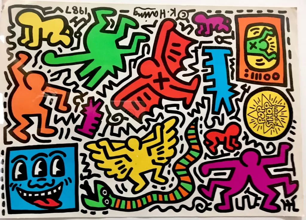
My inspiration on this piece starts from the classic "Evolution of Man" pictures that show the process of human evolution to great ape to homosapien to human, I found this to be an amazing way of showing growth, development, and passage of time, as I wanted my focus to be self determination and expression. I took the style of cell shaded figures from it, but instead made it go from a range of baby, to adult, to elderly man, instead of the evolution of our species as a whole. For the first piece of the triptych I wanted to convey the sort of innocence and undefined nature of a child, and explorative and curious style to match how a baby perceives the world and all of the things around it. I thought the best fit would be Pop Art, Which conveys the sort of bright and happy child like wonder that children see the world through. I went with the work of Keith Haring, who is a famous more modern pop artist. He mostly works with strong single colored figures with sharp thick black and white lines surrounding them, by creating space, but also drawing attention to each figure individually, which I thought would show the child like mind and colors. which is exactly how a child sees the world around them. The next one, I wanted to take inspiration from is Expressionism, as it shows off the way our young adult minds wander, and try to explain existence with theories that could be true, or are just completely crazy, they try to express them self, but are scared by the scale of the world around them. Expressionism is showing this perfectly through the art work. The artist I took inspiration from for this one is Edvard Munch, who created the piece "The Scream", Which is a psychedelic piece that shows a horrific figure on a bridge, with a wavy and colorful background that distorts what seems to be reality, which is why I wanted to include the background, to show how beautiful and scary the world is, showing the feeling of isolation, and grandiose to the world. The last art movement I am taking inspiration from is the Neo-Classicism era, which is a classical style of realism, that is most commonly seen in Roman style art, that depict high authority and classical values. I found this to fit perfectly with the thought process of an elderly man, who clings to the past or the "classical" days, and has a very set attitude on what the world should be and what it is. I took inspiration from the artist Jacques-Louis David, who created the shown piece "The Death of Socrates" which is a very clear cut and depicted piece of art, perfect for transforming to my image as the final piece to the psychological puzzle I have created.
|
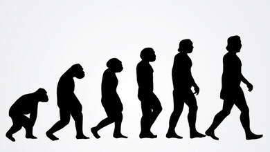
"Evolution of Man"
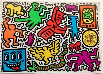
"Pop Shop Tokyo" Keith Haring
"The Scream" Edvard Munch
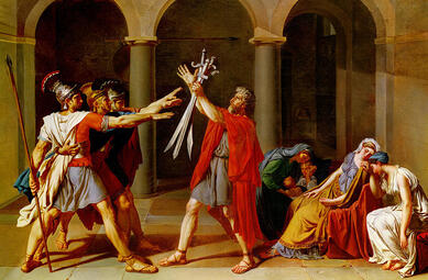
"Oath of the Horatii" Jacques-Louise David
|
Planning sketches
|
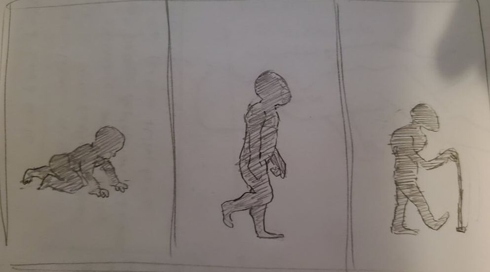
With this first sketch I wanted to just get the basic Idea of how the figures would look within my three pieces, I wanted to convey a basic silhouette of the ages I was going to represent, the first being the baby, I went with a basic side shot of a crawling baby, which I placed in the middle, and then cell shaded it to give contrast. I repeated this process with the other two, to make them easily recognizable to anyone viewing this piece. I wanted to convey the basic idea of the characters with their "Movement"
|
|
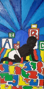
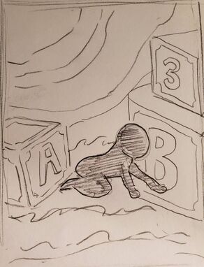
This sketch I wanted to represent the ideas and concepts I wanted to convey within child like innocence and how a child thinks, using building blocks with letters and numbers surrounding the child, with waves of color and silly like happy waves of sun and the ground to make it seem like a fairy tale. The child mind is highly impressionable but always assumes the happiest and best outcome and viewpoint of the world. So i wanted to convey the happiness in how I used Impressionism to my advantage.
|
|
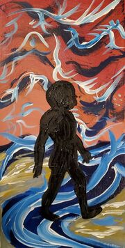
I wanted this sketch to look like "The Scream" but with a more whimsical and more desolate look, with branching paths and rivers flowing from the right and left sides, with branches stretching across to simulate almost this, "what am I gonna do with my life?" question, as this is what a young adult is thinking about during their day, because they want to succeed and have a good life, but may not know how to do that well or even at all. this stage in our lives is made specifically for exploring ones self and I wanted to convey that with the background of the piece.
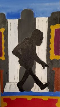
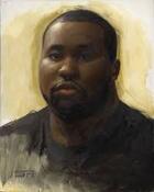
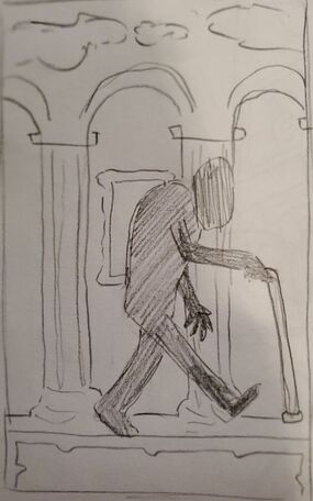
This sketch was the last one that I did, which shows an elderly man walking through the halls of a great cathedral, with classical paintings, and a red and gold carpet, with pillars of grand size, and a light blue Colosseum top, I wanted to show the isolation, and the refindness that comes with old age, and being elderly, I used the furnishing within the room and the hallway to sort of represent the classical nature of an elderly mind. Elders love the past, they love their past, in fact some disregard the present and future, as they saw no problem with the past. This kind of thinking is why I chose Neo-classicism, which I think expertly represents the mind and wisdom of an elder, confused by isolation, but comforted by history.
|
Process
Experimentation
|
With the first picture, I ended up just using the primary colors, Red, Blue, Yellow but with this it was difficult to have enough varying colors and to make the whole thing interesting and to have a popping color scheme. So I opened my self up to different secondary colors, white, and black. with all of these colors, I realized that If i really leaned into the type of colors I was using, very sharp and basic colors, it would compliment the Pop art style, along with the Baby/child theme that I wanted to keep up. I ended up using multiple brushes to get the whole process down, and even fixed up my methods with putting paint on as a wash layer (white usually) and then going over it with the color I desired to put down, this let the line work be smooth and efficient.
Now the second painting, I actually made was the 3rd painting with the old man, this one, I employed my new found strategy of painting a wash first then going over with detail later, making it so it looked smoother and much more clean for the actual product of the painting. I started with the carpet and made my way up to the pillars, where I went to the ceiling, using a big brush, to paint a blue gradient on top of white so It looked nice, then making my way down for the pillars and finishing with the background then the old man, which for the old man, I made a rough outline with a thin paintbrush, then filled it in with a bigger one to make sure I don't mess up the actual figure. The final painting and my absolute favorite, I went with a solid white background at first, to make a wash so all of my colors were smooth and easily blended together. I went in with my biggest brush which I just put a bunch of red, yellow and white paint and mixed and smoothed, and blended them all in with swirls and beautiful strokes of paint. followed by some blue that I put on in big lines with white accents, after letting the red dry. I wanted to go with a nice looking flowery, and bird like whimsical look to it. I then made a purple and blue stream of sorts, which I again used my massive brush, then was complimented with gray, white and yellow with a smaller brush to try to create more subtle details. I really enjoyed making this last one, which the final piece was the actual man in the middle, which was done last and just like the elderly man, where I made an outline and filled it with a big brush covered in black paint. |

|
Process
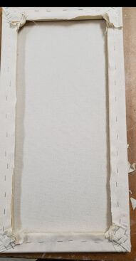
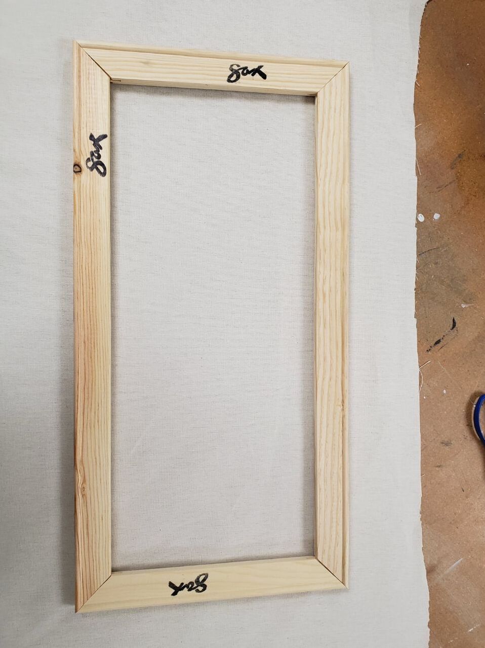
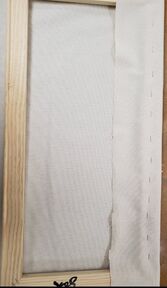
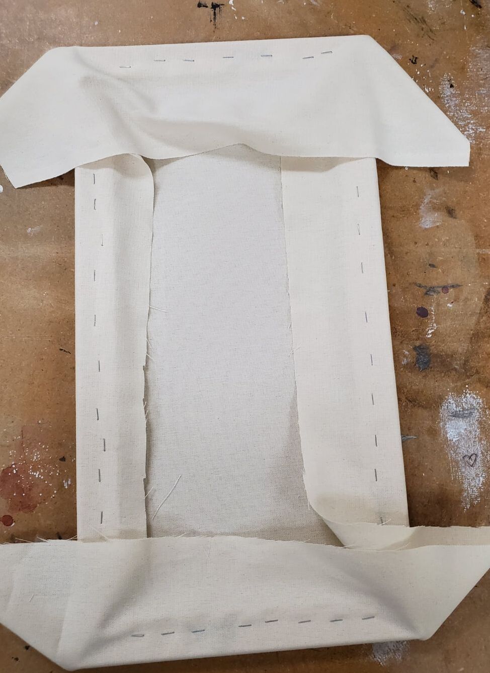
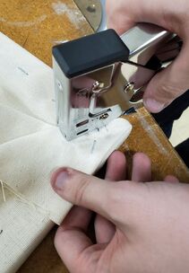
First I had to take 3 sets of 1 x 2 foot squares to stretch my canvas, I then put together a large rectangle made of wood to stretch my canvas out for the whole thing. I placed my frame on a freshly cut canvas, where I grabbed the edge and pulled it over the backside of the rectangle to staple it, making sure I tugged hard enough to keep it nice and tight, but not too tight or it will rip later on. From there I repeated by folding the canvas over the backside and stapling it down on all four sides and even the corners. From that step I cut off all of the excess canvas, so none of it hung off the edge of the inside of the frame repeating this twice more. after putting my name on the inside part where the wood is, I then gessoed my canvases, which hardens and tightens the fabric used to make the canvas so later I can paint on it efficiently, After doing this process twice more, I was ready to take my canvases home and start painting
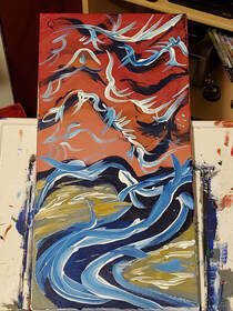
After this, I will use my last painting as it was my favorite as the example for my process, When I took it home, unlike the other paintings where I drew out a concept on the canvas and painted on top of it, I just went right in, I painted a base white color to smooth the canvas out and to make the paint that I put on top of it, much much cleaner and more organised and less grainy and gross looking. After I set that out to dry, I went ahead and started with a base red color, where I then added a small amount of yellow, where it blended into each other to create a sunset look to it, which I made wavy and layered so It was enthralling. From there I proceeded to add white to the almost dry paint to create accents and to lighten up the whole painting, proceeding with this I used a good amount of red at the top again to make the top darker and the bottom lighter. From there I added dark blue streaks across the canvas to create some depth and almost like branches across the sunset. Followed by white accents when the paint was drying to it created light blue lines within the white and blue areas which I thought almost looked like wings which I played into. I let the painting sit for 2 hours with a fan on it to dry so I can start the bottom portion of the painting i started with just a swirl of purple/blue on the bottom to compliment the blue branches on the top, adding more light blue with white, I created a sort of stream on the curved surface that was the deep blue river I created, then after all of that, I went in with gray on the open spots, to fill empty space, and to look like the painting "The Scream" more. With this, I added yellow to make it almost like a reflection in the water. I let all of this sit with a fan on it for an hour. Coming back to it, I quick sketched the human figure with a small brush with black paint, which was risky, but payed off in the end, as all I had to do was fill in the figure and then, my masterpiece was done, the 2nd painting in the triptych that is "The Evolution of Mind".
After this, I will use my last painting as it was my favorite as the example for my process, When I took it home, unlike the other paintings where I drew out a concept on the canvas and painted on top of it, I just went right in, I painted a base white color to smooth the canvas out and to make the paint that I put on top of it, much much cleaner and more organised and less grainy and gross looking. After I set that out to dry, I went ahead and started with a base red color, where I then added a small amount of yellow, where it blended into each other to create a sunset look to it, which I made wavy and layered so It was enthralling. From there I proceeded to add white to the almost dry paint to create accents and to lighten up the whole painting, proceeding with this I used a good amount of red at the top again to make the top darker and the bottom lighter. From there I added dark blue streaks across the canvas to create some depth and almost like branches across the sunset. Followed by white accents when the paint was drying to it created light blue lines within the white and blue areas which I thought almost looked like wings which I played into. I let the painting sit for 2 hours with a fan on it to dry so I can start the bottom portion of the painting i started with just a swirl of purple/blue on the bottom to compliment the blue branches on the top, adding more light blue with white, I created a sort of stream on the curved surface that was the deep blue river I created, then after all of that, I went in with gray on the open spots, to fill empty space, and to look like the painting "The Scream" more. With this, I added yellow to make it almost like a reflection in the water. I let all of this sit with a fan on it for an hour. Coming back to it, I quick sketched the human figure with a small brush with black paint, which was risky, but payed off in the end, as all I had to do was fill in the figure and then, my masterpiece was done, the 2nd painting in the triptych that is "The Evolution of Mind".
|
|
|
|
|

|

|
|
Compare/Contrast


|
Similarities
1. Bright and not shaded or gradient colors 2. black borders on all of the shapes/people 3. White background on all of the colorful shapes Differences 1. Mine has a black figure on the center 2. Mine has a giant radiant blue background to it 3. Mine was made with acrylic paints, while Keith's was made with markers Similarities
1. the background is wavy and colorful making it beautiful and scenic and also psychedelic 2. there are similar colors and a similar brush stroke style 3. the psychedelic style is seen in both, where its wavy and colorful Differences 1. Mine has less contrasting colors, and has more of a sunset gradient 2. Mine has a single black figure in it 3. there is a bridge with what seems to be a lake in the background to give a location, while mine has only a simple river Similarities
1. Has very classical aspects to it, with columns and marble walls and ceilings 2. Has more realistic looking figures and furnishing 3. more gradient than other pieces Differences 1. Has much more accurate to real life art work and furnishing in Jacques 2. Has human figures as the focal point while mine has one hat is cell shaded 3. Mine has more popping colors while the other has more dull and yellowed colors 4. different techniques were used |


|
Reflection
I think that I am pretty happy with how my triptych piece turned out, It doesn't look like what i was hoping for, but I think that 2 out of the 3 that I made are actually really good and compliment the actual style that I was going for really well, and I think that I did a stellar job on the second one, which I really loved in the long run. But I am not very happy with how the third one (the old man) turned out, as it really just doesn't look like the inspiration, and looks sloppy and not at all what I wanted, but I do think standing alone it could be decent. I think that I got my message about human evolution and the evolution of how our minds work as time passes very well, especially on the first two. Using pop art to show a child's mind, and using Expressionism gradient painting techniques on the background of the second one really hit close to home for me, and I think captured the lost and confused bathed nature of young adulthood that shows how odd the world can be especially when defining yourself. With the first one I wanted to show the blocks at the bottom like the building blocks of society and life, where this is the age in which we learn the foundations of our own lives, especially because the information is spoon fed to us when we are young, which is why all of it is so geometric and exact. While the second one shows the confused nature of figuring out what the stuff they didn't tell us when we were kids is all about, like what do I do when i grow up, and who are my friends, why am I here, what am I doing with my life, I can be this this and this, but at the cost of this. I think I captured the messages really well, Maybe not so much with the third and final one, but The message was to show how elders like to think about their past, and how their world was, and only think about how their world was great, ignoring the present and the future, because they are scared of change. Overall I think I did quite well on this piece and I am happy with the results.
ACT Responses
Clearly explain how you are able to identify the cause-effect relationships between your inspiration and its effect upon your artwork:
The Inspiration made me expand my way of painting to imitate markers, and oil paints with only acrylics at my side, which taught me new brush techniques with all of my paintings
What is the overall approach (pov) the author (from research) has regarding the topic of your inspiration?
To express ones self, and to be able to get a subtle message across while making it slightly obvious
What kind of generalizations and conclusions have you discovered about people, ideas, cultures, etc. while you researched your inspiration?
There are so many meanings to all forms of art and art movements, including ways to paint and to conceive how to do certain things, like going from fill in the blanks, to choose your own painting lines.
What was the central idea or theme around your inspirational research?
The evolution of the human mind, from brand new hope and determination, to meaningless and undefined world, to defined and set in stone world.
What kind of inferences did you make while reading your research?
How to make certain strokes in the art, how they shaded and made gradients, and what types of brushes they used for certain things.
Bibliography
Schöller, Eric, et al. “Oath of the Horatii, by Jacques-Louis David (1784, Louvre, Paris) Arts Council: Contemporary Art.” Arts Council: Contemporary Art, 28 Nov. 2019, https://www.njartscouncil.org/painting/oath-of-the-horatii-by-jacques-louis-david-1784-louvre-paris/.
“Keith Haring.” Keith Haring, http://www.haring.com/.
McMullen, Roy Donald. “Jacques-Louis David.” Encyclopædia Britannica, Encyclopædia Britannica, Inc., 26 Aug. 2019, https://www.britannica.com/biography/Jacques-Louis-David-French-painter.
“Keith Haring.” Keith Haring, http://www.haring.com/.
McMullen, Roy Donald. “Jacques-Louis David.” Encyclopædia Britannica, Encyclopædia Britannica, Inc., 26 Aug. 2019, https://www.britannica.com/biography/Jacques-Louis-David-French-painter.
